Logo: types of logos. Company logos
The logo is the flag of the ship, with a good flag it is not scary to go to sea, fight pirates, discover new lands and look for treasures.
A logo is a kind of emblem, stamp, coat of arms, company identifier, its face, shell or outer part, which the company shows on all types of advertising, from business cards to large advertising posters. The logo should be associated with the brand image, its products or services. Yes, this is not a ship with the whole crew, guns, steering wheel, but the logo carries something intangible value. And this valuable should serve as a hook in the consumer's head between the company's products and its identification in the form of a picture-logo. Especially when a consumer encounters a company's products or services for the first time, he first of all looks at the logo and tries to understand whether the company can be trusted, whether he will become its client or not.
The logo is needed so that everyone can accurately identify the company from its competitors, as well as for brand recognition and uniqueness.
Analyzing countless logos, I have identified the main factors, i.e. those moments that distinguish a successful logo from its mediocre counterpart.
They will be discussed in this article.
#1 Association with a product/service
The logo should immediately make it clear what the company does.. And this is perhaps the main rule of a successful logo, which sounds like this: if during 3-5 sec, looking at the logo, you understand what the company produces / sells or what services it provides, then this can be called a good logo.

Everyone will unmistakably recognize the hyped type logos Starbucks,Coca Cola,McDonald's,Nestle, but you can try to look at lesser known logos and understand what the company is doing. If you have learned products or services in such a short time and understood WHAT the company does, then you have a great logo that does its job. If you can't tell, then the company initially loses, because cannot create a bridge in the head of the consumer "logo-product".
I'll tell you on the example of the project logo "Sea of Desserts". When the project was planned, I wrote a small one, in which I described all the basic rules for creating a logo. TK must be written necessarily, because. otherwise, the output may not be what you expect, but I think that this is not worth explaining. So, after developing the logo, I showed it to everyone, from schoolchildren in the yard to friends from social networks. All as one said that the Sea of Desserts company is most likely a confectionery, makes cakes, and this very cake is depicted on the logo. The logo did its job - anyone who looked at the logo for 3-5 seconds said exactly what I wanted to hear. True, I did not ask women a lot about this, and this is the main audience of the project. Therefore, to hit the bull's-eye, think for yourself - how your target audience will perceive your logo, what it can mean for them and what product or service they will associate it with.
![]()
#2 Customer Benefit
The idea of the logo should intersect with the benefit of the client. It is best to “sew” into the logo the benefit for which the client buys your product or service. For example, I really like the logo of a shoe company Chester- This is a picture of oak leaves. The company thus says that their shoes are very durable like oak, the brand adheres to the old English traditions (oak as a symbol of strength and longevity). A good example that will play out in the minds of buyers for a long time to come.

A good example is a brand logo Eleganzza, manufacturer of Italian bags and accessories. The company successfully promoted the idea of real Italian quality among customers, invented the Italian history of the brand foundation and successfully established itself in the market. The logo depicts the face of a maiden in the style of a Venetian fresco, evoking associations with the past, making the brand "real". The benefit for the client is originality, not a fake, Italian quality, time-tested.

Examples from online - electronic giant, which stylishly and simply depicts a smile arrow. She explains that they have a large assortment and you can find whatever your heart desires.

Restaurant food delivery service delivery-club.ru is another good example. Their logo uses the image of an ostrich. The ostrich is a fast animal, so the company is associated with fast delivery of pizza, rolls, etc., which is a big plus for its business and an advantage for the consumer.

Using a customer benefit in a logo will set you apart from competitors who may not.
#3 Emotions
The logo should evoke positive emotions. A successful logo should not be very bold, pompous or very funny and inappropriate for the company's activities, in other words, it should be “in the subject”. When a company is engaged in, say, auditing services, and the logo looks childishly naive and funny, this does not evoke the desired image in a potential client. Ideally, the logo should create positive emotions that match the overall image of the company.
I will give an example with a company logo Disney, looking at which everyone will accurately determine what the company does and for whom it offers its services.
![]()
Not every logo evokes positive emotions. It is better if the logo evokes in the mind something that a person has experienced and remembered. The Sea of Desserts, according to consumers, evokes neutral-positive emotions, since a cake and blowing out candles on a birthday are very joyful memories associated with childhood and making a wish. And with the sea, people have thoughts about relaxation. Agree, pleasant moments?

#4 Color
The logo must have its respective color. Let me explain a little the psychology of colors. Green is growth, health, freshness, environmental friendliness (farm products, medicine). Red provokes tension, excites. It’s not just that we are told that red, yellow and black are impulsive purchases. A logo with these colors is good to use in retail, where the purchase decision is made quickly and spontaneously. Dark purple and blue-green are the color choices for budget buyers, while blue is mostly suitable for neutral buyers, as it does not cause irritation and does not provoke any actions (which is why the main color of the interfaces of many forums, social networks is blue: Facebook, Vkontakte).

Rice. "Power of Color" (Russian version)

Rice. "Colors and Emotions" (Western version).

Rice. "Three Types of Buyers" from the 2014 Small Business Online Survey by Aori
Also remember that in the market you need to be different from other players. Therefore, you should not use the color of your competitor in the logo, look for your own solutions. Keep in mind that different people perceive colors differently. Compare the color you use (or want to use in your logo) with your customer, look at the competition, and you'll see what color works best for your logo.
#5 Time
The logo must stand the test of time. Ideally, it should not be that in a week, month, or year, the logo ceases to be liked and becomes irrelevant. In the first case, perhaps your views have changed, you have grown up and do not consider the logo to be what it used to be. The relevance of the logo is a complex issue, especially today, when flat interfaces and icons are in vogue. But that's why there are all sorts of rebrandings that allow you to rethink not only the logo, but also the values and goals of the company, its purpose. Ask the target audience in a month, six months, a year: Is the logo still relevant? Is the logo still for this target audience? Does the logo still represent the face of the company?. The answers to these questions will allow you to find out the answer to the main question: “Do I need to change something, or is everything fine?” Perhaps this is an important strategic question that needs to be answered. The main thing is not to overdo it)


Rice. "Evolution of logos" and comic simplification in the future
A good logo is like fine wine, it only gets stronger with age.
#6 Relevance
The logo should be modern for today. As far as the logo is relevant or modern, the better it will be remembered in the mind of the consumer. A good logo should look on-trend with the latest design trends, not be old-fashioned. Recently, such styles as overlapping, rectangular frames, identity, calligraphy, leiting and other terms from the jargon of logomakers are very popular.

![]()

![]()


Using one of these techniques is modern and fashionable, but there is a nuance here. What looks trendy today, in a couple of years, may be just rubbish. This is a short-term fashion that should be avoided and should not be carried away. Take a look at the history of logos that have survived short-term bursts of fashion. What do they have in common? Why are they still relevant today?
#7 Riddle
The logo, ideally, should be with a riddle, with a double meaning. A logo can be insanely beautiful, like a painting in a museum, but to be honest, I have always liked logos with some kind of chip. Over time, I realized that this feature is called "double sense of the logo." The highlight of such logos is that if the user remembers their “double meaning”, then he will remember it well for a long time, as if he came out the winner and solved some riddle about the trademark. People like to guess some secrets and riddles, so such a move will only be beneficial for the company.
I understood the idea of “double meaning” a long time ago and concluded that such a logo is remembered better than just some beautiful picture. For example, we all know the logo FedEx(Federal Express), where a forward arrow is indicated, explaining to the buyer that the company is also keeping up with the times and moving forward, providing fast delivery.

An interesting logo of the mentioned store, where a smile arrow marks the letters "A" and "Z", thus showing that this Internet giant has a huge selection of goods.
There are lesser known but also recognizable double logos, examples of which I give below.
![]()
![]()


![]()
![]()


![]()


![]()
In the case of the logo "Sea of Desserts" I also used this feature. I wanted to do something simple, but at the same time, to make some sense in the icon next to the letters. So a cake with candles appeared, and in the form of a filling, waves flaunted, like by the sea. The yellow circle symbolizes the sun.
![]()
#8 Slogan
The logo must have a slogan or tagline. Do not believe those who say that a simple name or text option is enough. Remember the Euroset slogan - “Euroset phones - prices are just oh ... th” or "Your pussy would buy Whiskas". Laws, however, also apply online. A well-chosen slogan will advantageously distinguish you from competitors, allow you to position your product, and make it clear to the buyer what you do if he did not understand this from the name or graphic design. After all, it is not always clear WHAT AND WHO, but after reading the slogan, everything falls into place. I recommend inserting USPs, differences, or the most important thing that the company does into the slogan.
Examples of successful slogans: a chain of pizzerias « Papa Johns" — Better Ingredients, Better Pizza, abandoned cart service « – Turning abandoned carts into sales, "Accountant for Business" — Timely assistance to your business, "The Tenth Dimension" — Turn on new experiencesEco-furniture- kitchens as art.
![]()


![]()
Using a successful slogan, you will be a little higher in the eyes of the consumer. And again in "Sea of desserts" I used this technique, our slogan " Is there a holiday? There is dessert!” shows that if the buyer has some kind of holiday, then our site is at his service. We have a large selection of confectionery, so to paraphrase the tag line, you can get “celebrate, and we will find dessert for you!”

#9 Character
Not always, but in some logos you can use a character. Colonel Sanders at KFC, Starbucks Mermaid, Pringles Chef, Dodo Bird at DodoPizza- these are examples of successful introduction of characters into the logo. I would even say that for some brands, the characters are the logo. It is very rare that such a technique can be used. It is best to create an additional character and already carry out promotion work with him. Especially good cartoon characters aimed at a children's audience.

#10 Simplicity
The logo should be simple. Everything in the world today comes down to simplification, because we live in a time when an avalanche of information falls upon us. Interfaces are getting simpler, website designs are getting flatter. Simplicity is perhaps the most important criterion for a modern logo. You should not make some complex masterpiece, a picture that is difficult to understand. Logos can be complex, but the best logos are simple logos. It often happens that the logo leaves one first impression, but the company is engaged in a completely different one, and the logo does not match the overall image. In my opinion, the logo should first of all sell, and then be beautiful and “cool”, with “frills and curls” as some modern designers like to draw. If the logo sells, then it can be as simple as "2x2". If it fits into the image of the company and (important!) the client can tell within 3-5 seconds what this company does, whether it sells goods or services, this is considered a good logo. Even if he is ugly. Even if it is a crooked text, it is not the logo that is important for the client, but the product that the company offers is important. It also happens that the logo is no good, but the company is still a success. This explains that the role of the logo is secondary, while the product or service itself is primary, it is more important for the target audience. As in the usability of sites, the rule of 3-5 seconds also applies here, for which you need to both like and understand what this company offers. If you look at the logos of global companies, you will find that for many of them the logo is just text.
![]()
![]()


The best logos are the simplest, so think simple)

*************************
Let's summarize. I'm not saying that everything I wrote about in this article is the strict rules for creating a good logo, there are other equally important aspects. I applied these factors when designing the Sea of Desserts logo, which meets 9 out of 10 principles (except for the character). Yes, this logo was not drawn by me, but by a professional designer, but I just thought WHAT SHOULD be depicted in order to convey the main idea to the consumer. No need to make the logo look like a competitor, use the same color. The logo should evoke positive emotions, be modern, have its own unique slogan. The double meaning makes the logo interesting and memorable, as well as a well-chosen character for the target audience. Finally, the logo should be simple, no frills, relevant and modern, evoking positive emotions. Always remember the proverb "they are greeted by clothes, but they are escorted by the mind."
Good luck and inspiration in creating or rebranding your logos!
The activity of any company begins with the creation of a corporate identity, the main components of which include the development of a logo. It is this emblem that demonstrates the belonging of a product or service to a particular enterprise, displays its concept and carries a certain semantic load. Let us consider in more detail what a logo is, types of logos and the basic rules for their development.
Definition and meaning
A logo is a display of information about a company in a graphic format, its symbolic representation, a symbolic personification that contributes to the recognition and authority of the company. In other words, this is the abbreviated name of the organization, presented in the form of the original style, using a special font, style and illustration. The value of the logo in the business world is enormous: it distinguishes the company from similar enterprises, attracts the attention of potential consumers to it, “tells” about it, forms the first impression. After all, it is through the logos of companies that consumers form a certain opinion about their activities.
Power of Influence
The logo will always and everywhere in plain sight decorate letterheads, signs, business cards, documents, uniforms of employees. Therefore, its creation should be approached with the utmost responsibility, finding the right balance between pragmatism and creativity. A logo is not just a pretty typeface created for aesthetic purposes. A well-designed symbol is able to attract consumers, leave competitors behind, and ensure stable growth and revenue for the company. While an unsuccessful logo created in haste will quickly get lost among the bright brothers, forming a negative impression of the organization.
What is a logo: types of logos
Graphic style and symbols
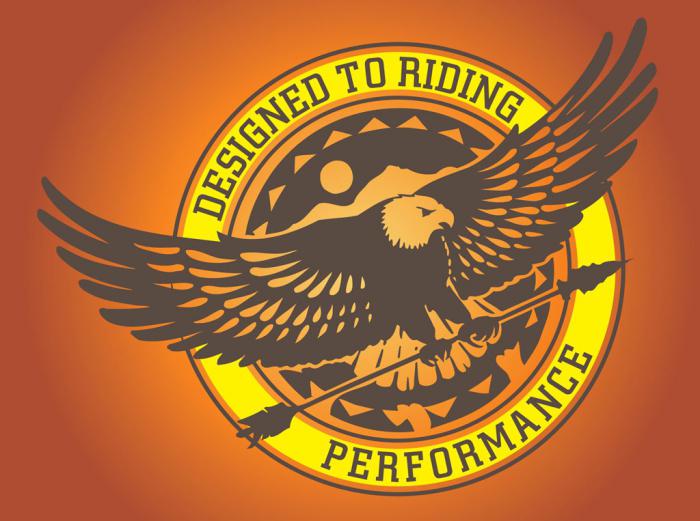
Displays data about the company through graphic symbols - photographs, pictures, drawings - without the use of text. A graphic image of a symbolic logo represents the essence of the product by illustrating the activities or the name of the company. For example, a logo in the form of an eagle can indicate the name of an organization, “talk” about its high business and moral qualities, and be used by travel companies as a symbol of a safe and successful flight. Graphic designations in their pure form are used quite rarely and are preferred by well-known brands. However, with enough experience and talent, creating the right, alluring and strong logo is not difficult.
Text representation
Letter styles are used by firms much more often than graphic ones. Logos have a lot in common: the abbreviated name of the company or its activities, abbreviations are usually expressed in a graphical way using special fonts, unique characters (for example, Coca-Cola, Panasonic, Bosch). The advantage of a text logo is that it evokes clear associations and a clear idea of the company.
Combination of types
The combination of two types of logos is presented, as a rule, in the form of a symbiosis of a graphic image with a visual inscription (slogan, company or brand name). Combined company logos are considered the most informative and successful for non-promoted companies.
Alphanumeric style
This style is the most common and actively used by many companies due to their accurate display of information. The alphanumeric type of the logo is relatively easy to develop, as informative as possible and retains an individual style of writing even after typographic processing. Examples: Ford, Kodak, Sony, Motorola.
The main features of a successful logo
A beautifully designed logo, the types of logos that you decide to opt for, cannot guarantee you brilliant results if the basic requirements were not taken into account during development:

Features of creating logos
When developing a logo, great importance is attached to the colors, font and shape of the emblem, which can directly or indirectly affect its perception from a psychological point of view.
- Color. The color scheme of the logo is chosen in accordance with the impact of a particular shade on the human psyche. For example, green, blue, blue colors make only a favorable impression on a person, calming and enticing, while the red and bright orange palette acts excitingly and aggressively. In addition, you need to take into account the meaning and associations of color, so as not to get into a mess. Experts recommend using no more than three colors in the sign design, completely abandoning shadows, gradations and blending.
- Font depending on the direction of the company, it can be serious, concise, intricate, using curlicues and roundings. It should be easy to read and understand.
- Form. Recommended shapes are triangle, square, circle and combinations thereof. The correct form of the logo is a holistic, organically fitting on any surface, proportional system of symbols without the use of small details.
A start-up company, which is at the stage of developing a corporate identity, needs to know what a logo is, types of logos, basic requirements and features of its creation. Because a properly designed logo is of great corporate importance.
A logo is a symbol of your business, an icon by which your company is recognized visually. Designing this element of corporate identity is not an easy task. But we know where to start - with choosing the type of logo. 99designs editor Hilda Morones(Hilda Morones) counted 7 types of logos. Among them there are text, graphic and mixed
Word and letter logos
1) Abbreviations and monograms
IBM, HP, VTB, MTS, NASA... The creation template is clear, right? All of these logos are abbreviations for long company names. A trademark of 2 or 3 words is much harder to remember than "initials". Agree, it is easier to pronounce NASA than the National Aeronautics and Space Administration (English: National Aeronautics and Space Administration). Letter logos and monograms are the best option for companies with wordy names.

When developing such trademarks, special attention should be paid to the selection of fonts. Lettering not only needs to match the style and ethos of the company, it must also be legible so that it can be read on small mobile phone screens and business cards. Those who have just opened a business can at first place a transcript of the abbreviation under the logo.
2) Word logos (trademarks)
Word logos work very well when the company name is short and clear. Let's take Google for example. A catchy name combined with a colorful font form a strong brand identity. Since verbal logos focus on the name of the company, typography again plays a key role. Choose or create fonts that convey the essence and character of your business

Fashion brands, for example, would benefit from clean, elegant typography with a pretense of luxury. But legal and legal agencies are better off choosing traditional "heavyweight" fonts. They create a sense of security and safety.
Image logos and symbols
3) Graphic signs (or logos-symbols)
Logo-symbol (icon, pictogram) - design based on graphics. This is the visual image that comes to mind when you hear or think about, for example, Apple, Twitter, Android. The logos of these companies are so iconic, so rooted, that their recognition can only be envied.

Brand visualization built solely on the image is great. You can put a deep idea into a logo-symbol, with its help you can evoke the necessary emotions in the audience. However, this solution is not suitable for everyone. With such a logo, it is difficult to promote a new, but non-unique business. The disappearing messaging app Snapchat with a ghost logo has managed to be remembered and promoted. John Deere with the "expensive" logo in the form of a running deer, too. Another example of the successful use of the logo-symbol is demonstrated by the World Wildlife Fund with its stylized image of a panda. But in general, there are not so many such examples. So, if you are not sure about the triumph of a business idea, it is better to bet on the name, and not on the symbol.
An abstract label is a specific type of graphic logo. It is based not on generally understood recognizable images (like the Apple apple and the Twitter bird), but on abstract geometric shapes. The most famous examples are the Pepsi circle, the Google Chrome disk, the Adidas flower. Like all graphic logos, abstract labels condense the brand into a single image. But only they allow you to create truly unique and inimitable images for the visual presentation of the company. With an abstract logo, you can convey what your brand symbolizes without relying on cultural and historical background. Ideas and emotions can be laid down with the help of color and shape - no recognizable patterns are needed.

Abstract logos are a win-win for international trading companies. The icon is also an icon in Africa, and the name, if not in each, then in many of the countries of presence, will definitely have to be translated.
To create abstract logos, it is better to involve professionals who can combine colors and shapes to create public meanings.
Often colorful, sometimes cartoony and always cheerful, a mascot logo is a great opportunity to create the face of a brand, its official representative, a character who will become an "ambassador" of your business. Mascots are great for companies working with families and young children. They allow you to create the right atmosphere, set the dynamics and mood when communicating with the audience. Remember at least mr Proper, the founder of KFC, Colonel Sanders

One of the main benefits of a mascot logo is that it can stimulate interaction with customers. It is an effective tool for social media marketing (SMM) and promotions in the real world. The only pity is that this type of logo is not appropriate everywhere. For example, talismans look rather ridiculous on business cards.
Combined logos
6) Text-graphic signs
Combined text-graphic signs - logos consisting of letters / words and images. World famous examples: Burger King and Lacoste. A logo in which the graphic image works in close conjunction with the company name is a universal choice. The symbol / talisman of the audience immediately begins to associate with the brand. In the future, it will be possible to completely abandon the text.

7) Emblems
Emblem - a logo in which the font is inside a symbol or icon. Such logos are created on the principle of seals, coats of arms, tokens. As for the area of use of emblems, such brand names are best suited for schools, non-profit organizations, government agencies, and food industries. Logos of this type are also popular with automakers. Yes, many of the emblems look outdated, but there are examples of successful design modernization. For example, in the 21st century, the updated emblems of Harley-Davidson and Starbucks look relevant.
We have collected examples of best company logos, and not entirely successful. We will tell you why they became so and what they can teach us. But before we get started, here are a few important things about the company's logos and business. These basic principles will help you navigate the value of a logo to an organization's business, its relationship to success, and the cost of logo development:
The success of the company as a whole does not depend on the quality and thoughtful design. If there were any other sign in place of the Apple logo, would the company become less successful? Hardly.
By itself, no one needs a logo. What matters is how and where you use it. Successful organizations use the logo at all points of contact with the customer. In this way, customers have an ongoing association with the company's products and the experiences they gain by interacting with the company.
- Profitable successful business / high-quality expensive design - excellent!
- Profitable successful business / bad cheap design - bad!
- Unstable unprofitable business / high-quality expensive design - terrible!
- Unstable unprofitable business / bad cheap design - bad!
- A young business / inexpensive logo is fine!
So, now is the time to move from general principles to specific examples. Let's start with samples, you can familiarize yourself with them in the next section of the article.
The best logos of firms and companies
We have selected for you the most striking examples of high-quality logos that have helped a number of companies become global leaders in their industries. These include brands such as:
General Electric
The logo of General Electric, one of the leading manufacturers of equipment, has remained virtually unchanged since the company was founded in 1892.
And why was it necessary to change it? The 'GE' initials, written in intricate script and framed by arcuate strokes, combine simplicity and efficiency - exactly the qualities that consumers expect from General Electric products. What's more, the emblem, built around an art nouveau ornament, is reminiscent of the spinning drum of a washing machine, one of the company's most popular products.
JPMorgan Chase
JPMorgan Chase is one of the leading financial conglomerates and the largest bank with an asset value of an astonishing $2.35 trillion.
Moreover, JPMorgan Chase is the sixth largest public company in the world. In other words, it is a brand that speaks for itself.
Admittedly, the bank managed to accurately convey its dominant position with the help of the logo.
What makes the JPMorgan Chase logo recognizable and effective?
With a simple, bold typeface and minimal use of graphics, the JPMorgan Chase emblem conveys power and authority, as if to say, "If you don't pay on time, we'll charge you more late fees than you ever dreamed possible." Harsh, right? But one should not expect another attitude from such a serious organization.
If you are at least a little familiar with, then you do not need to explain what Facebook is.
![]()
Notably, Mark Zuckerberg's company was originally called The Facebook. But the article in the name did not last long, and the company itself made a real revolution in the Internet community, rapidly becoming the most popular social platform in the world.
The Facebook logo has the most valuable quality in graphic design - it allows you to instantly identify a brand. Taking care of maintaining a recognizable visual image, the company made only minor stylistic changes to its logo, leaving the main elements intact.
ExxonMobil
ExxonMobil is the largest oil company in the world, generating astronomical profits for its owners and shareholders. Exxon and Mobil were once two different firms that decided to combine their knowledge and resources in 1998 (perhaps with the ambitious goal of establishing world domination).

Such a successful and reputable organization should have an appropriate logo! But in this case, as they say, something went wrong. The ExxonMobil logo, with its simple, uninteresting design, fails to capture the character of such a powerful brand.

Unfortunately, the logos of individual companies before their merger often look more distinctive and original than the emblem of the merged company.
What conclusion can be drawn from this story? Less is not always better.
I think millions of people will subscribe to my words if I say: “THANK YOU, AMAZON!”. Thanks to the Amazon Prime service, I can order absolutely anything and receive it within 48 hours (or even faster). And all this with free (well, almost free) shipping.

Knowing its strengths perfectly, the online store skillfully reflected them in its emblem. See the arrow that stretches from A to Z? Symbolizing directional traffic, the arrow indicates that Amazon will deliver your order from its warehouse directly to your door. But that's not all the meanings contained in this simple icon. The arrow also resembles a smile, indicating that the company guarantees a high quality of service, making sure that its customers are satisfied.
Microsoft
Despite some missteps that have accumulated over the past few years (yes, Zune and Windows 10, we are talking about you!), Microsoft did a great job redesigning its logo in 2012.
![]()
The logo, which lasted from 1987 to 2012, was pretty good (I especially liked the O, which looked like Pac-Man), but left a lot to be desired in terms of design.
In terms of color, the new emblem looks much friendlier. And the one who came up with the idea to present the main products of the company in the form of four square windows is a real genius! The blue window symbolizes the Windows operating system, the red one represents the Office software suite, the green one represents the Xbox game console, and the yellow ... Yellow does not mean anything, but since the window cannot have three panels, we will assume that it is necessary.
And it's also worth noting that of all the companies on this list, Microsoft has the most trouble building a sustainable visual identity. Judge for yourself: every time the computer giant makes changes to its logo, it looks completely new, as if it has nothing to do with the company's previous logos.
Nike is known not only for its sports shoes, but also for one of the best logos in the business world. The iconic Nike swoosh is a prime example of how a visual identity can play a huge role in building a reputation and transforming an ordinary company into a trusted, respected brand. If the Nike emblem was not considered something remarkable before, over time it has become a visual identification of sports culture.

In English-speaking countries, Nike's "swoosh" is known as the "swoosh". "Swoosh" is the sound we hear when an object rushes past us. Thus, this word denotes a sharp sound, speed and movement, which is successfully reflected in the curved shape of the logo.
The history of the Nike check mark is notable because it shows the logo's evolution from an "ugly duckling" that no one liked to a "beautiful swan" that draws admiring glances.
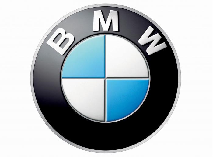
The "parents" of the legendary BMW logo are the round Rapp-Motor emblem with a black silhouette of a horse and the Bavarian flag with its characteristic blue and white checkerboard pattern. This is how the familiar black circle appeared, inside which blue and white quadrants are located.

After the First World War, which ended with the Peace of Versailles, the company switched from aircraft production to the production of motorcycles and cars. The BMW emblem has remained virtually unchanged since 1917. The most noticeable transformation took place in 2000, when the logo gained volume due to the 3D effect.
mastercard
Back in 1966, Mastercard was known as Master Charge, and its first logo featured two intersecting circles (bright orange and yellowish red) with the words "Master Charge: The Interbank Card".
![]()
In 1979, the company shortened its name to the capacious MasterCard. New name - updated logo! The colors on the emblem have become brighter, and the font has become more solid. In 1996, the logo became voluminous: now "slits" appeared in the area where the two circles intersect.
FedEx
In 1971, the postal service's logo featured the company's full name, "Federal Express", slanted.
![]()
The emblem was made in patriotic red and blue colors, which evoked associations with the American government. Having gained popularity due to its original logo, the brand decided to say goodbye to it in 1994. The new design was as ingenious as the old one: hidden between the letters E and X is an arrow that indicates speed and accuracy as the main advantages of the postal company.
The first IBM logo was created in 1924 when Computing-Tabulating-Recording was renamed International Business Machines.
![]()
This gave the company's name a more modern sound, and the 1924 logo became an updated version of the 1911 logo that had previously been used by CTR. The sophisticated CTR logo, with its airy, ornate typeface, gave way to a cumbersome "International Business Machines" lettering (with an emphasis on the word "International"), which was placed inside a circle symbolizing the globe. In 1947, when the brand carried out a significant modernization of its technologies, the round emblem was replaced by the abbreviation "IBM", which was destined to become a symbol of the company. In 1956, graphic designer Paul Rand redrawn the letters, making them black and more massive. The new design emphasized the brand's qualities of stability and resilience. In 1972, Rand was commissioned to rework the look he had created. To create a dynamic and flexible image, the designer made "slots" on the abbreviation. This is how the famous "striped" emblem turned out, which IBM is pleased with to this day.
Despite the external diversity of all the above signs, they were all designed according to similar criteria, which made them so successful. These are the factors we will discuss next.
What can you learn from these logos?
What conclusions can an entrepreneur draw from reading the stories behind these logos?
Decide what your logo should communicate about the brand
The emblem should reflect the essence of your brand, emphasizing its most characteristic features. For example, looking at the logo of JPMorgan Chase, you immediately understand that we are talking about an influential company with a reputation that has been developed over the years. How does your logo characterize your business?

In just a couple of minutes, you can create and download a logo for your organization. The small logo is available for free.
What is the most important lesson you learned from this article on good and bad logo examples? Do you have some more tips for entrepreneurs who are working on their corporate branding? Share your ideas in the comments!
Every day a person comes across hundreds of logos. They are so familiar that few people think what they mean. But in fact, even the simplest logos often take months and millions of dollars to create, and almost every one of them has some subtext. In our review of 10 famous logos with a decoding of their meaning.
1. Fedex

The logo of an American logistics company consists of 2 parts: the inscription "Fed" in purple and "Ex" in orange. It seems to be nothing special, so why did such a modest logo win dozens of awards? The answer is simple - the space between the letters "Ex" forms an arrow, which on a subconscious level is associated with the speed and professionalism of the company.
2. McDonald's

Most people think that the logo of the McDonalds fast food restaurant chain is nothing more than the first letter of the company's name, painted in golden color. However, fans of Freud's theory argue that this form of the letter evokes associations with a nursing mother's breast.
3. Museum of London

The Museum of London is dedicated to the history of this city from the time of its founding to the present day. In 2010, the museum management decided to update its image in order to become more attractive to a younger audience. The new logo was made in bright colors and is sure to attract attention. At first glance, the new logo immediately presents a map of London. And each of the colored contours is the boundaries of the city limits of the British capital in different historical eras.
4. Adidas

The name of the famous manufacturer of sportswear and accessories arose from a combination of the first and last name of its founder, Adolf Dassler. Over the 66 years of the company's existence, its logo has changed several times, but it has always had three stripes. Today, the logo has three slanted stripes in the shape of a triangle, which symbolizes the mountain. This metaphor means conquering new heights.
5.Mitsubishi

Mitsubishi was founded in 1873 as a result of the merger of two shipbuilding companies. The company's logo appeared by combining the coats of arms of its creators - the three-leaf crest of the Tosa clan and three diamonds of the Iwasaki family. The three diamonds symbolize reliability, integrity and success, while the red represents trust and attracts customers to the brand.
7. Google

The Google logo looks very simple - just a regular inscription, the letters in which have different colors. In fact, when creating the Google logo, the designers wanted to capture a sense of the company's "rebellious spirit". The secret of the logo lies in the colors of the letters: the primary colors (blue, yellow and orange) are suddenly interrupted by a green letter that is out of the scheme. So Google decided to highlight its non-standard and unwillingness to play by the rules.
7. Animal Planet

Previously, the Animal Planet logo featured an elephant stretching its trunk towards a miniature Earth. However, in 2008 the channel was rebranded in order to increase its appeal to a wide audience. The channel had to get rid of long and boring documentaries and move on to captivating reports. The new logo, as Animal Planet explained, should represent instincts, the jungle and primal emotions. Quite a lot of emotion for an emblem that had one letter upside down.
8. NBC

It's no secret that the NBC logo symbolizes a peacock, but few people know why this is so. It was actually a marketing gimmick to get people to buy color TVs. At the time the logo was created, NBC was owned by the electronics company Radio Corporation of America (RCA). RCA wanted to show the public that the relatively high price of a TV was entirely due to the ability to view pictures in color.
9. Amazon
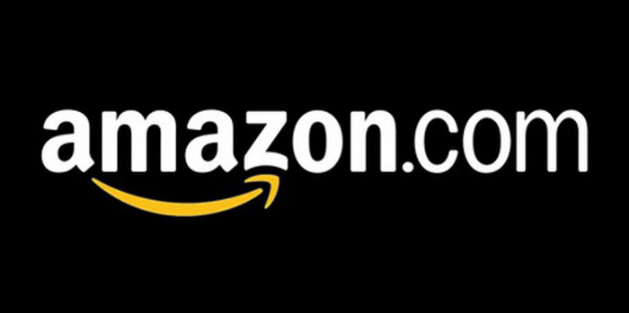
At first glance, the Amazon.com logo is very simple - the name is in bold black with a curved yellow arrow underneath. But what does this arrow symbolize? First, it represents the smile of a satisfied customer. And secondly, the yellow arrow goes from the letter "A" (the first letter in the Latin alphabet) to the letter "Z" (the last letter of the alphabet), which symbolizes the diversity of Amazon products.
10. Pepsi

The Pepsi logo is a simple circle with the top half red and the bottom half blue, with a wavy white line between them. At first glance, these are the colors of the American flag. But in fact, Pepsi has spent hundreds of millions on its current logo. The branding agency that designed the logo for Pepsi released a 27-page report outlining the many meanings behind the logo. It symbolizes the Earth's magnetic field, feng shui, Pythagoras, geodynamics, probability theory, and more.


Popular
- Why Beijing suffers from dense smog
- Packing in paper filter bags
- How to “promote a hotel” so that it would earn?
- Can you make money from streaming?
- Top Most Interesting Twitch Streamers
- Unusual wedding car magnets Pickup points?
- After filming the program "On the Knives", the chef quit the restaurant
- Overview of the automation system for a cafe, restaurant and shop Poster POS How the randomizer works
- Showroom opening Showroom what is in clothes
- Overview of the best copywriting and rewriting exchanges Runet content exchanges and their characteristics